Ok, this is it! Our final and last project of the year (I am pretty sure it is anyway) is finally here. So here is what it is. We must listen to music. During the listening to the music, we must draw how it makes us feel. We must decide whether the music is warm or cool, smooth or jagged, calm or crazy. From these decisions we will create a painting that corresponds with a specific song. Since last semester when everyone else was doing this project, I was already sure that I would struggle on this project. I just knew it was not going to be easy AT ALL! I don’t even have any idea what song I would do! I am freaking out just a little bit. But anyway, we are going to be listening to several songs on Meserve’s computer and then painting out how it makes us feel, just so we can get an idea about this project. This really isn’t easy. Seriously not at all. I am not good at drawing a feeling that a song gives me. Actually, it doesn’t really make any sense to me. Oh well, here we go, and wish me luck!!
I have finally finished my painting! This took me kind of a long time to finish. Since it is getting closer to the end of the year, I am just getting tired and it is taking me a little longer to get things done. But none the less, I have finally finished my painting. I really enjoyed painting this. It was a lot of fun to take a really great artist’s art work and create my own painting, but still following his style. Eyvind Earle’s artistic style is a lot of fun. It has a lot of round edges and bright colors, so I really liked painting this style for a second time. For this painting, I wanted to use a lot of colors, because last semester, the picture I chose did not have a huge variety of colors, so I wanted to really mix things up. I would say that the hardest part of this project was trying to get the huge variety of colors to still look good all together. I personally think it looks pretty good, but my brother said he still likes it, it is just a lot of color. But I really like how it turned out, and that all that matters! 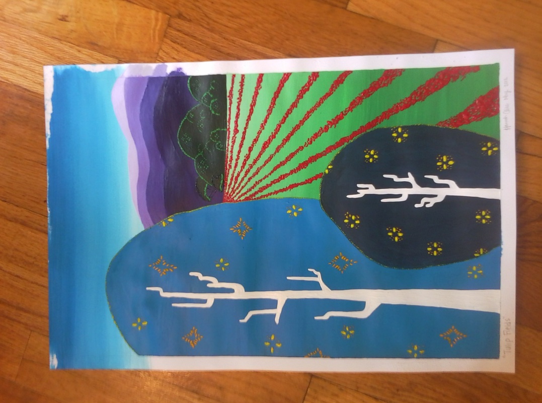 So I have begun the very very very very very very very long and potentially difficult thinking process for creating my Earle esk painting. I have drawn many many many different sketches with ideas for this painting project. One, I believe, includes big trees in the front and hills in the back, another has some bushes in the back ground. I even tried to make on that looked sort of Texas like for my sister. But I wasn’t really liking any of my sketches. But then finally I came up with a sketch that I actually like! I had two big trees in the front, some hills in the back, a bundle of trees in the back, and a field of red flowers. This sketch kind of combines a little bit of every thing that Eyvind Earle puts into his serigraphs. Not only did I include just a little bit of every thing he pretty much uses, I also am using bright colors, another artistic element that is a part of every Eyvind Earle painting. I am excited to start this painting process. I really enjoy the style of Eyvind Earle’s paintings. They are a lot of fun, to both look at and make! Next step, the painting process!! (picture of sketch to be added later!!) 
Alright, so here is the next project. I like this one a lot! So any way, we are required to create an original Eyvind Earle esk painting. I like this one because last semester, I really enjoyed the assignment of copying an Eyvind painting. It was a ton of fun! But anyway, now I have to come up with a really cool idea for this one. I want it to look really like his paintings, but still a little like mine, but also look really really really really cool. So, like the stamp project, it will take probably many hours of thinking and research on Eyvind Earle’s serigraphs until I come up with the best picture ever! I think that this will be a little hard though. He, Eyvind Earle, has such a distinct art style, so I will have to capture that distinctness as well as not actually copying his works. This is going to be a little hard, like several other projects, but non the less, and am pretty much really really really really really really excited to do this project. I hope I can make something that looks good, looks Evyind Earle esk, and something I will like to look at. Wish me luck!!
Finally, I have finished my stamp and the process that goes with it. I think I made almost 20 stamps, that includes the shirts I made! I think that this turned out really good! I like it any way. I think that the idea of John Lennon’s head was way better than a dog or a Viking helmet. At first, I was feeling really bummed out because I just could not come up with that idea that makes me go “Yeah!”, but after feeling super bummed, I finally got an idea, and one that I actually like. Any way, I did a ton of different color combinations with this stamp. I did purple and pink, then some rainbow and black, “tie dye” (sort of), weird splotches everywhere, multi colored and black, and just a whole bunch of other ones that I put together. Then, I made a t-shirt. For this one, I just used plain old black, and then I had made another stamp that said “Imagine” and I stamped it on the back of the neck. I really like the t-shirt. This project was actually a lot of fun, once I finally got an idea I was proud of. 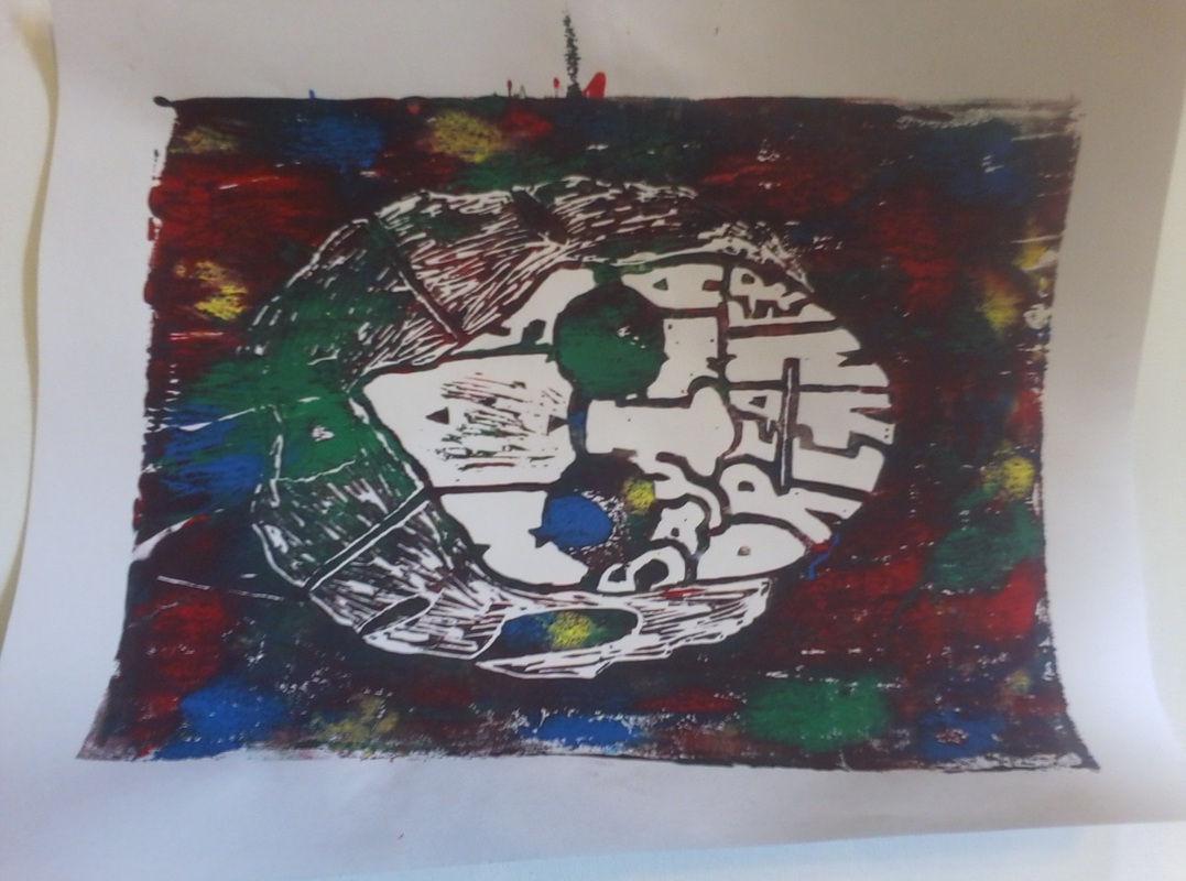 Alright, so I have gone from one sketch, to the next, to the next and not I have the perfect one. Like I said before, it is John Lennon’s face with “You may say I’m a dreamer”. I am now at the stage of creating the stamp. The process for this is first, taking the final sketch and tracing back over the sketch with a 6B pencil making the lines darker. From that, you take the sketch and then rub it over the stamp, this process transfers the sketch onto the stamp so that I can see what I am and am not cutting out. After I cut out everything, I do a test stamp to see what I still need to cut out. I think that this process is sort of fun! I like cutting the stamp. I am not sure why, but I think it is kind of fun. Anyway, so I finished cutting out everything that I needed to have cut out on the stamp. After a ton of stamping with that stamp that I made, I cut out the negatives on the back of the stamp. In other words I made an opposite stamp on the reverse side of this stamp. The opposite stamp is what I used to make a T-Shirt. 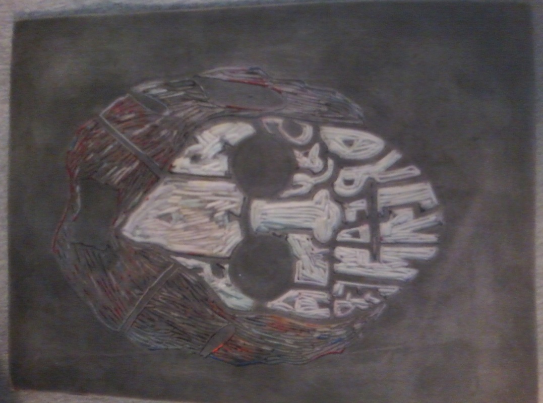
Finally, I have come up with an idea! It took a lot of planning, several lame and not good at all sketches, and many hours of thinking (slight dramatization) but an idea has struck me! I am also actually excited about this one. I really like it! Ok so here is the plan. I am going to take John Lennon’s face, the one that is pretty much really well known, and then I am going to put the words “You may say I’m a dreamer” in inside of his face. I did a couple of sketches already of this idea (unfortunately, those sketches are MIA, so if or when I find them, I will post them). I am really liking the idea I have now. Hmmm, let me think, what else can I say about it… Well the first sketch I made was too small and did not have spaces in between, so I made the second one which was larger and had spaces in between the letters. I am hoping that I am able to make the stamp look like the sketch. Otherwise this will just look like an old lady or something with words on her face. I hope this works out!! And not for the next step, making the stamp!
Alright, so I have started some sketches for this stamp project. I was thinking of doing something about something I like, like dogs! I drew out a sketch of a dog, and then filled it in with the words “Man’s Best Friend”. I am not sure if I really like it though… It just is not that great. I am not feeling it that much, to be honest. 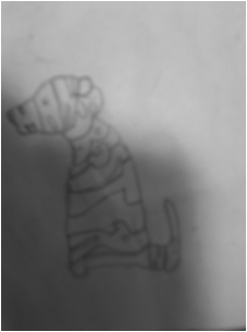 So I drew a sketch of a Viking helmet. I thought, well hey, I am going to Western Washington University next year, the mascot is a Viking. I pretty much thought that this was genius! Little did I know that it really is NOT easy to draw a super cool and amazing looking Viking helmet. So it pretty much did not turn out the way I was hoping it would. I was even going to put the school motto “Active minds changing lives” into the helmet outline, but it really just was not that cool. It was honestly pretty boring! I guess it is back to the drawing board for me. 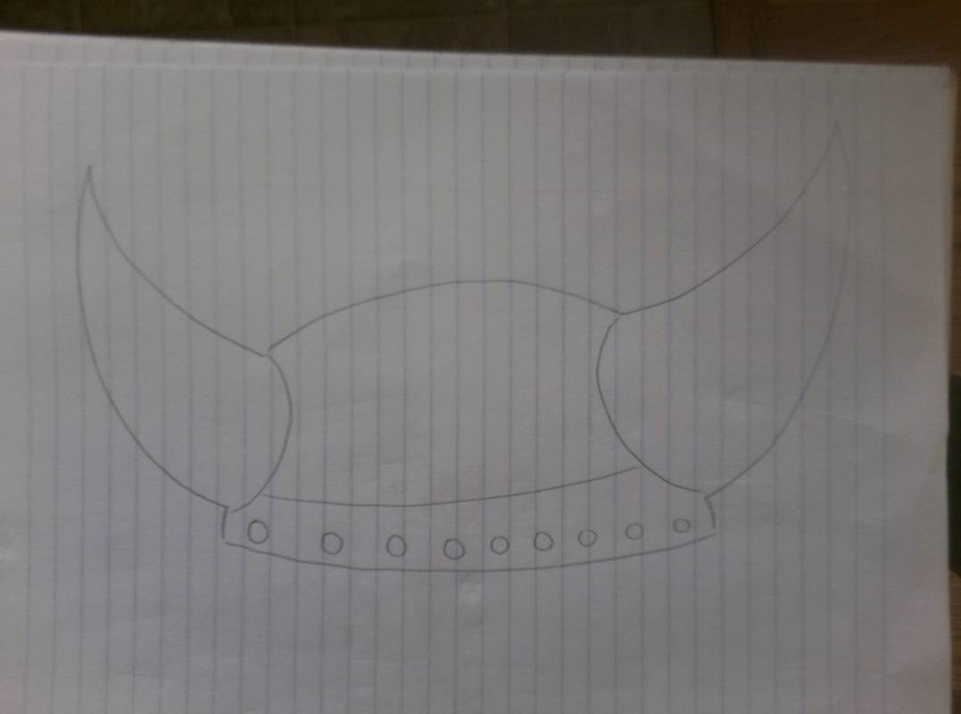 At this point in the project making process, I am just feeling defeated! I really want to make something cool, but I am having trouble coming up with a concept I will actually like and maybe want to frame and hang up on my wall. That is why I hate projects like these. I want to make something so cool, but I just don’t have the creative capacity to come up with something so cool. I am feeling bummed now…
Ok, so we have learned what our next project is going to be. We are doing stamps, again! Almost like what we did last semester, except that the stamps we are going to use are like, five times bigger than the ones we used before. Just looking at the blank stamp is very very intimidating. Anyway, more on the actual project itself. For the project, we have to come up with a phrase, or a word that we like. Then from that word or phrase, we have to come up with a picture, and make the picture out of the word or phrase. It sounds really hard. First of all, I always have so much trouble with these kind of projects. The ones that sound so cool, and I want to make something so cool, but I can never think of anything cool! I am thinking something along the lines of a Viking (for Western), but I will have to sketch it out and see how I like it. Already, everyone at my table is coming up with funny and good ideas. Like Micah is doing a pretty funny one. And Kaitryn came up with also a clever and funny concept… Hmm I am just not sure what I should do!
Ok, so I finally finished this color palette project. it took a lot of time, and a couple mess ups, before I finally finished it all. Now for the explanation of my colors and the process I went through to get them RED Dark Red- For the dark red, I took the regular red and mixed in some darker red and black. Medium Red- I used the regular red, mixed in just a little bit of the darker red, and then a little, like the littlest dib dab of white. Light Red- I took the regular red paint and mixed it with a fair amount of white. ORANGE Dark Orange- I took the orange colored paint, then mixed in some red, but just a little bit. Medium Orange- I took the regular orange paint and mixed a little bit of yellow into it. Light Orange- I took the dark yellow and mixed in a little bit of orange into it. YELLOW Dark Yellow- I took the dark yellow paint and mixed in a little bit of regular yellow. Medium Yellow- For this color, I mixed the regular yellow with just a little bit of white. Light Yellow- For this color, I mixed the regular yellow paint with a lot of white. GREEN Dark Green- For this color I mixed the green paint with black. Medium Green- For this color, I mixed the regular green with just a little bit of white. Light Green- I took the color I made for medium green and mixed in more white. BLUE Dark Blue- For the dark blue, I took the blue paint and mixed in black. Medium blue- For this color, I took the regular blue paint, but mixed in a little less black than I did for the dark blue. Light Blue- I took the regular blue paint than added it to some white paint. PURPLE Dark Purple- I took the purple paint and mixed in a lot of black paint. Medium Purple- I took the purple paint, and mixed in a little bit of black and just the smallest little dib dab of white. Light Purple- I took the purple paint and added it to some white. 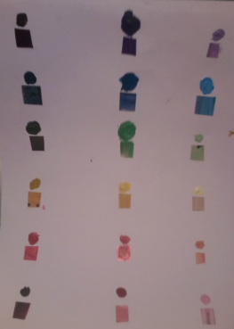 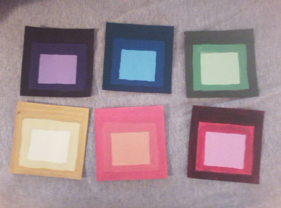 | AuthorMy name is Hannah. I love art! ArchivesJune 2012 Categories |
 RSS Feed